Overview
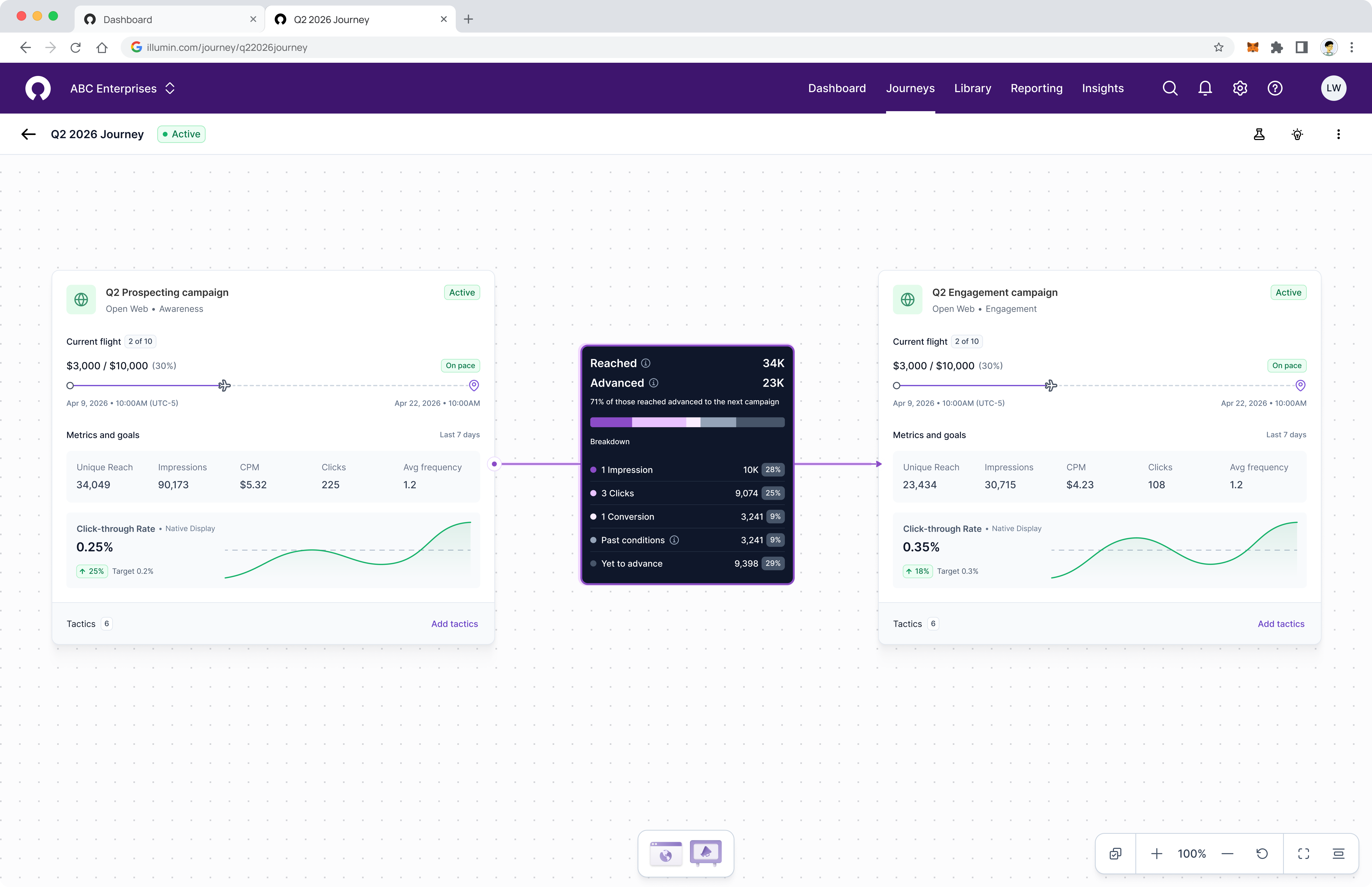
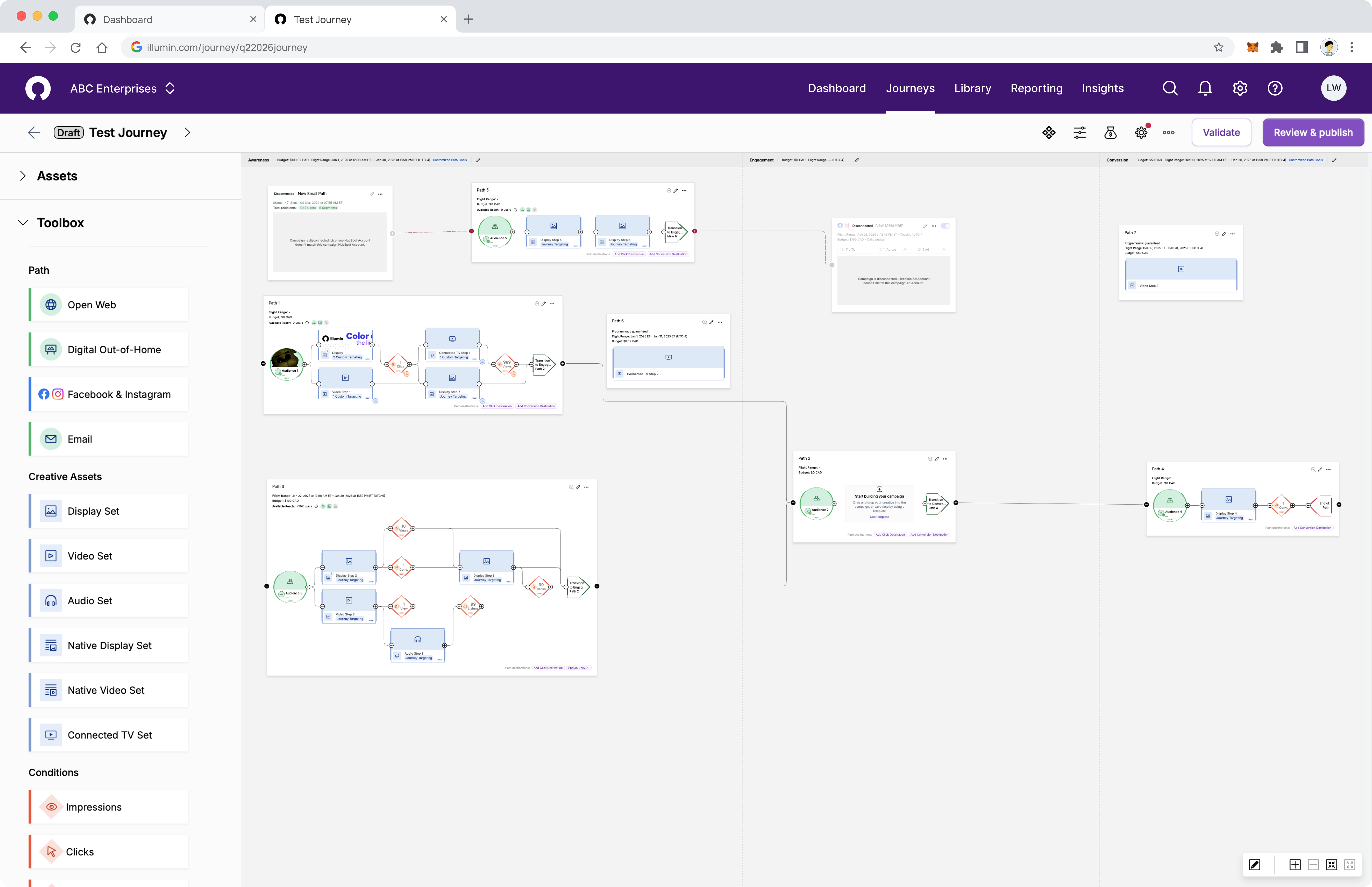
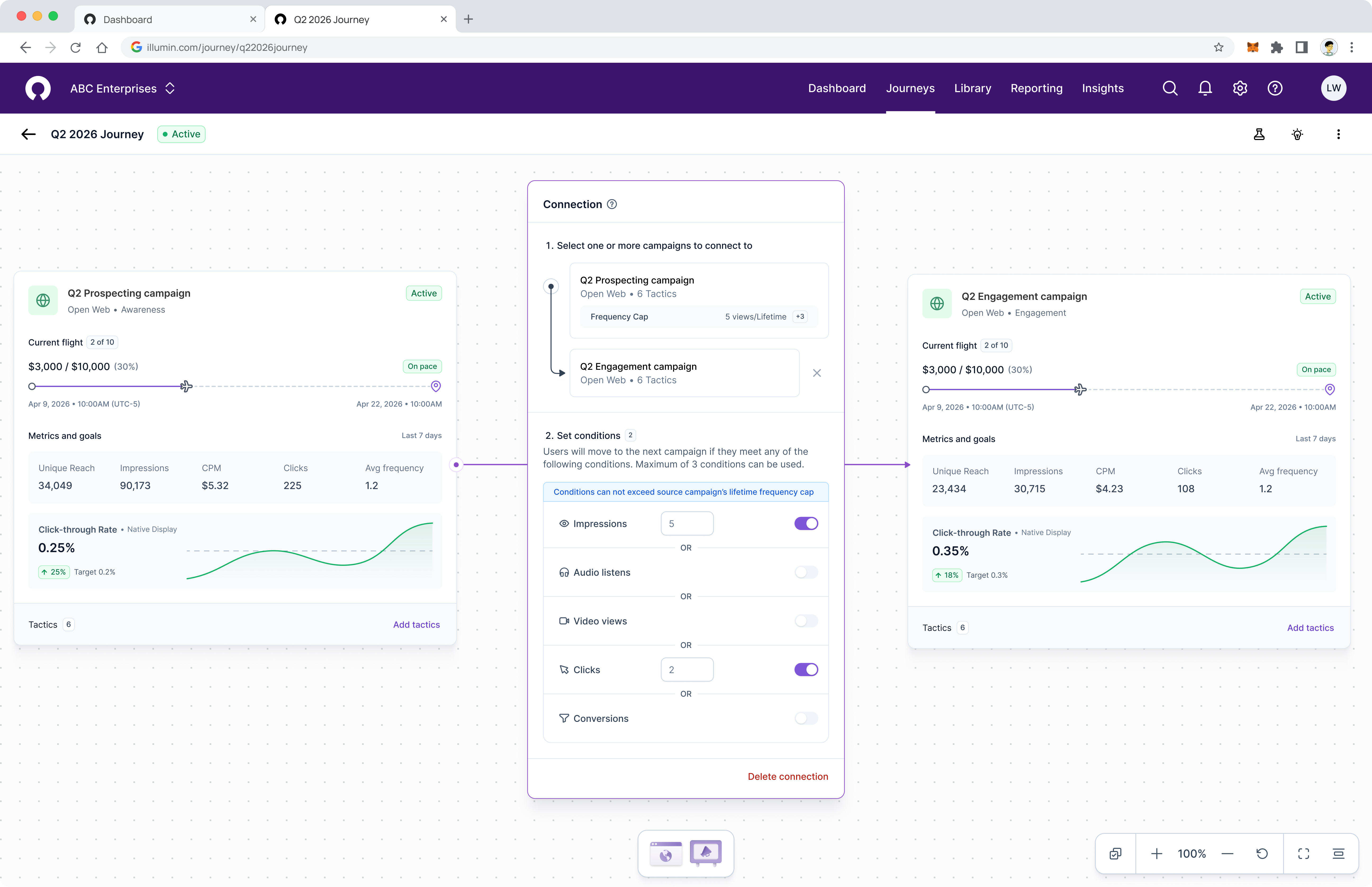
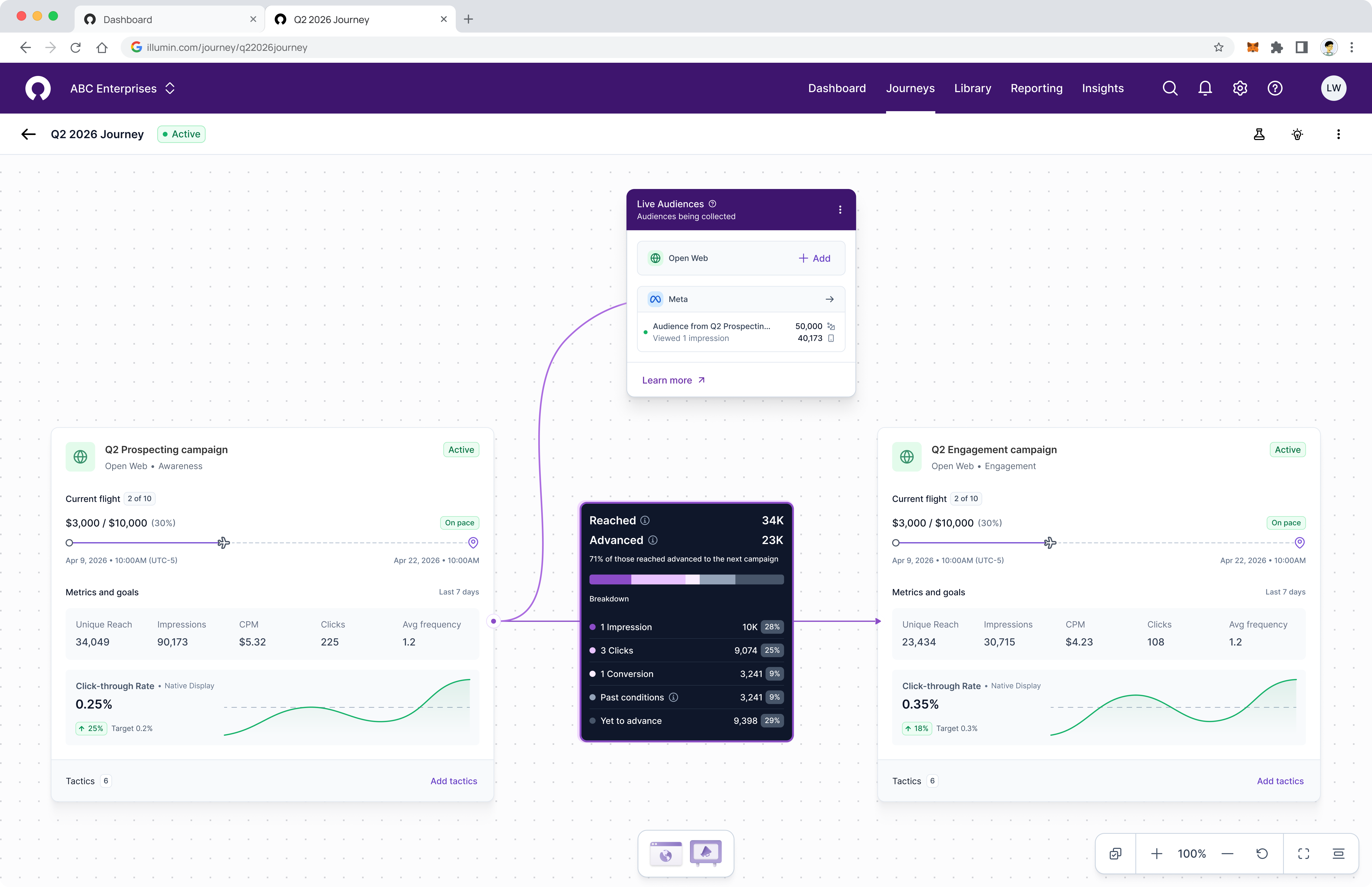
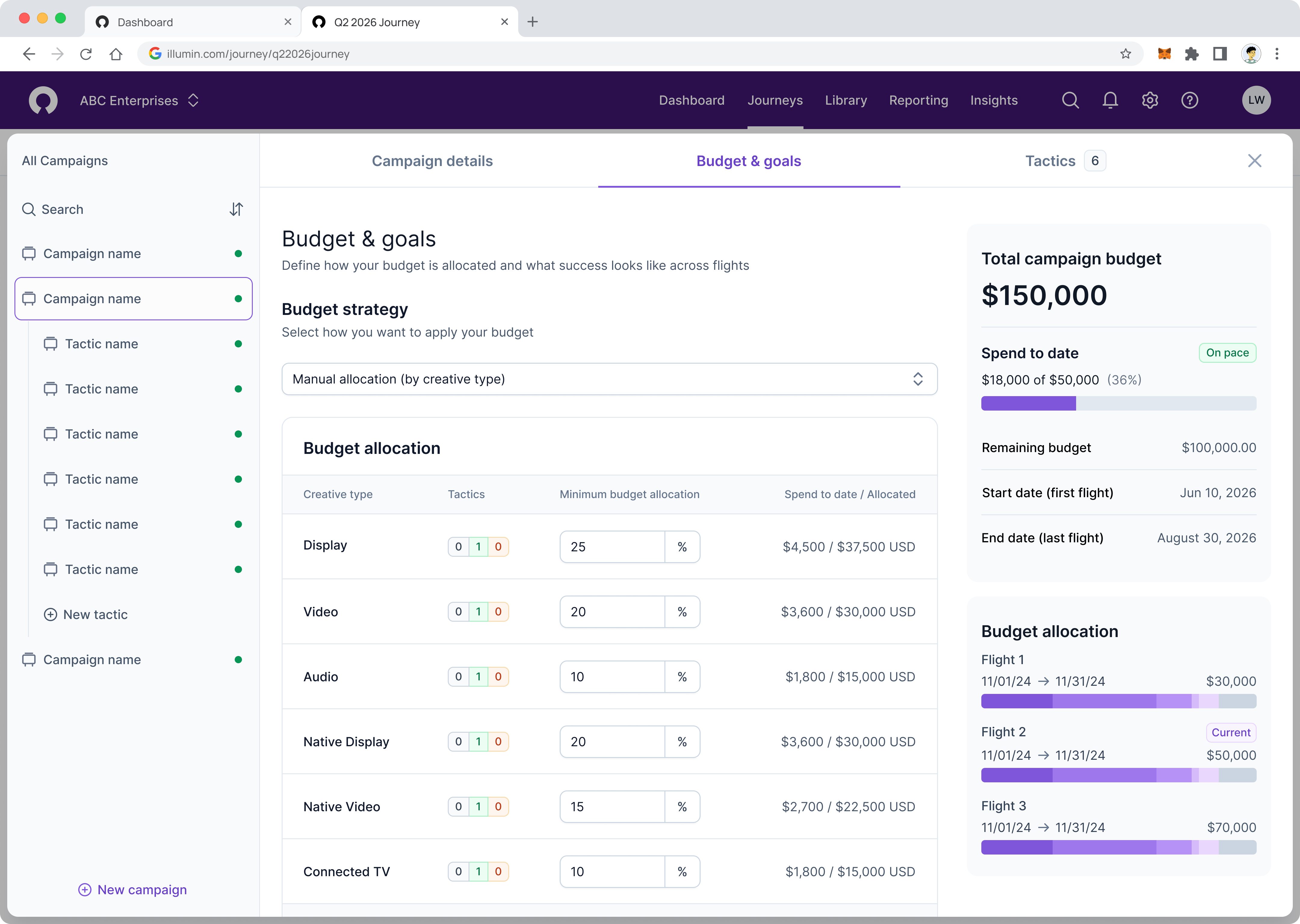
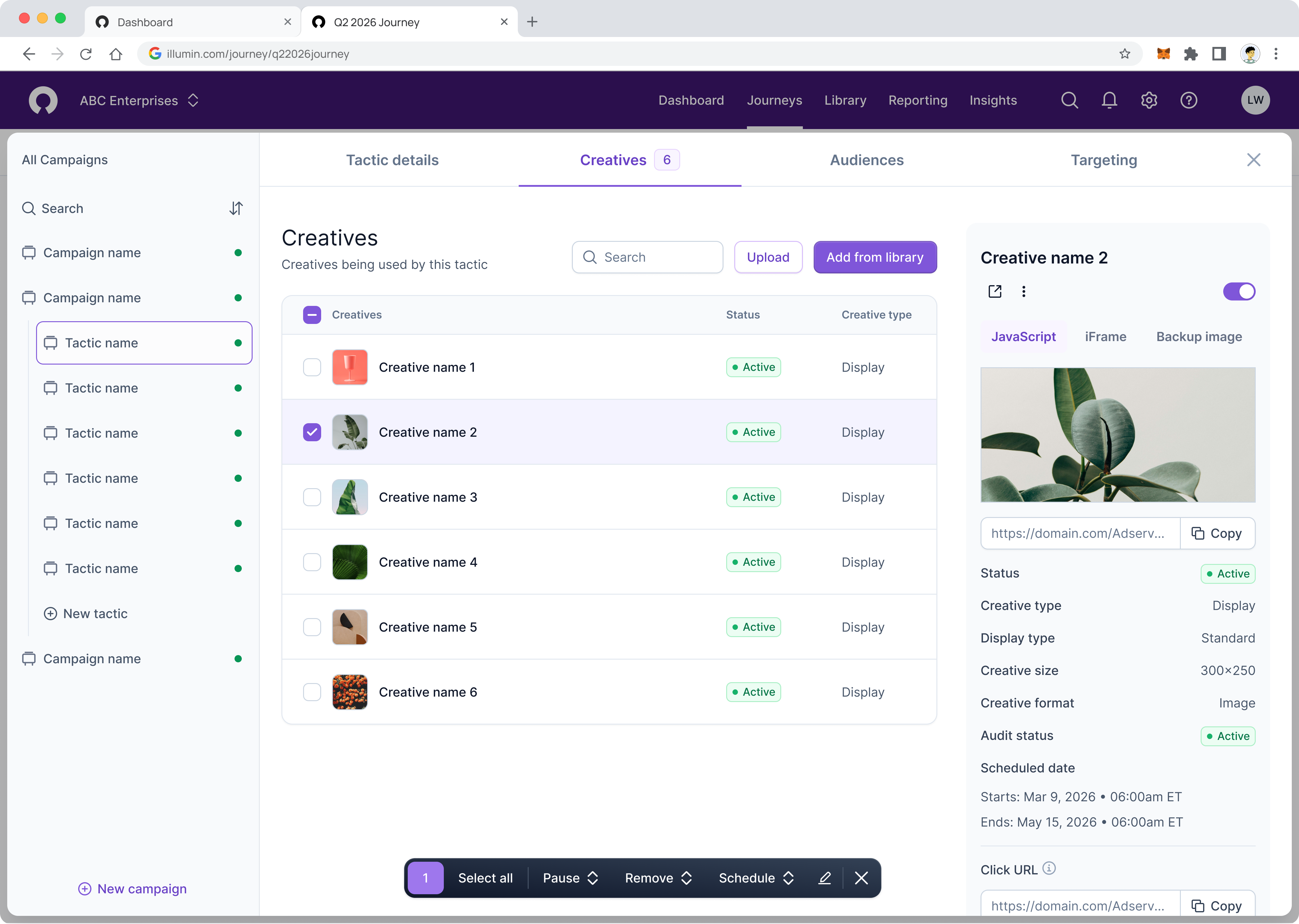
The campaign canvas is one of the highest-traffic workspaces in the platform. It is where users build and connect campaigns, define audience progression between them, and monitor performance in real time. Despite being central to the product, it had become a significant source of churn risk and support burden as campaign complexity scaled.
The goal of the redesign was to reduce the barriers that were limiting user success without sacrificing the depth that power users depend on. This meant making trade-offs between flexibility and guardrails, and establishing a component foundation that the broader product could build on.
The problem
The existing canvas had accumulated issues that made it slow to use, difficult to learn, and prone to errors with real campaign performance consequences. Compounding these issues, the underlying technology powering the canvas had become a constraint on what was possible, limiting our ability to address problem areas effectively.
01
Campaign structures could grow too complex, reducing audience scale and reach without users realizing it.
02
Over-reliance on drag and drop created unnecessary friction and slowed down even experienced users.
03
Fragmented workflows increased task completion time.
04
Core features were buried and difficult to navigate to.
05
Non-standard terminology created a steep learning curve with little in-product support.
06
End-to-end campaign setup took significantly longer than it should.
Research
To eliminate the risk of internal bias influencing findings, we conducted research with both an internal researcher and an independent external researcher.
Internal Researcher
Deep product knowledge and access to existing user data, enabling fast synthesis and comparison against prior research.
External Researcher
Independent perspective free from product familiarity bias, ensuring findings reflected user reality.
Approach
The existing canvas technology simply would not scale to our needs. Replacing it was a joint call between design and engineering. I assessed alternatives and landed on React Flow, and engineering reached the same conclusion independently. That alignment meant we could move fast and build the right solution for users.
Opinionated design
Rather than giving users unlimited flexibility, we made a deliberate call to simplify the campaign model so it functioned in a way users already understood.
Consolidated workflows
There were simply too many ways for a user to complete a task, causing design and engineering overhead. Consolidation meant less time designing, less engineering effort, and reusable workflows that scale throughout the platform.
Redesigned navigation between campaigns and tactics
I designed and led implementation of a new management view: a full-screen modal that borrows familiar layer-list and folder patterns allowing people to move between campaigns and tactics quickly.
Established a modular component system
Beyond a modular design system, we broke workflows into reusable components so teams could ship consistent patterns product-wide.
Results
Competitive testing against other DSP platforms and our own internal benchmarks showed large time savings across core setup tasks.
20%
Minimum time
saved
78%
Maximum time
saved
1×
Unified
component system
The time savings were a direct result of consolidating workflows, replacing drag and drop with faster interaction patterns, and eliminating navigational friction. The modular system has delivered value beyond this project, allowing teams to build on the same foundation.
"We didn't have to look for anything. It was all right where we needed it to be."
User feedback, post-launch